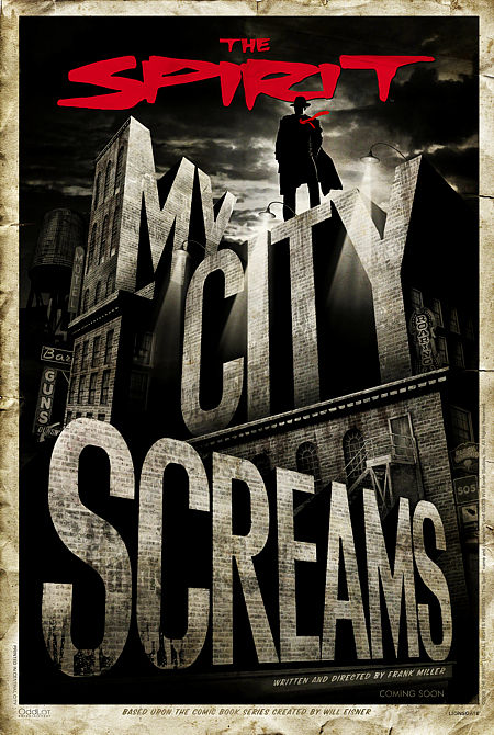
 |
 |
Article by E.C.McMullen Jr. March, 5, 2015 |
|||||||||
|
|||||||||||
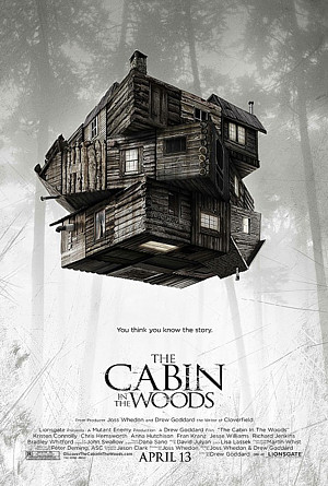
We could have had this cut, drop, and paste Photoshop layered pile of crap.
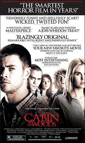
*Sigh*. At least the characters are IN character.
Yeah, there are great poster artists and there are bad ones. But I'm trashing the people who give crappy posters - a representation of the film maker's work - the green light. These miska-mouska-marketeers who ask for, even demand, crap.
The same great John Alvin I lauded for Warner Bros. THE LOST BOYS also did this poster for WB's, INNOCENT BLOOD.
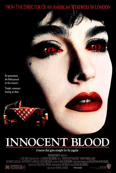
Back when outdoor Drive-In theaters were a big deal, this one played at a Drive-Thru.
I'm sure John knew the difference. But as I've learned, sometimes the customer actually wants a pile of crap*. I know. I've had clients coach and push and needle until I created the bastardpiece that set their hearts on fire, while crushing mine.
*It's a thing we artists and creative types deal with several times a year^. <-- I know that previous sentence appears needlessly tragic and melodramatic, which is why I provide this link to The Oatmeal as an illustrative example. ^ We don't want the job, but we take it because we love money. Never let a wealthy artist or programmer tell you they abhor money. They are lying hypocrites. Also, never let a starving artist or programmer tell you they don't love money. They are losers. Real artists like myself have a strong work ethic that demands Chinese or Indian buffet once a week and being the Aunt and Uncle who always gives the "Cool!" presents. Plus that Starving-Artist-Recognized-After-You-Die shit is for the birds. Fuck those birds! |
I know Beauty is in your freaking eyeball and all that, yet I've learned to turn those customers away (as realistically as possible. Well, personal finances considering. Okay, let's say I've learned to weed out the weaker of the clients). The money to work ratio isn't that great with such people and it ruins your portfolio.
So it's one thing when a bad movie has a bad poster, but I've paid money to see a terrible movie because the poster was so good it tricked me.
For certain though, I've avoided a movie at theater prices because the poster was so terrible.
For those of you who aren't artists, I'm probably not speaking your language. I may be making about as much sense to you right now as your dog barking Longfellow's "The Village Smithy" (coming soon to a theater near you).
So to my struggling, independent creator siblings, Beware! You need to control the look of your work. Whther or not you respect the concept of a "brand" when describing your art, in the market it will always be a brand. That means what you do is still your brand and you need to own your brand. A poor representation of your magnum opus can flush it and all your hard work right down the toilet.
Let's not pretend the world is fluffy. Life is both beautiful and harsh and there is one hell of a lot to do and nowhere near enough time in life to do it all. Short of experiencing a work directly (flipping through channels), we all judge books, movies, music, people lovers, and everything else, by covers.
If we didn't, who would bother with artists in the first place?~
![]()
END
~By now you're detecting an irony, or at least a dichotomy in my article. You want to say, "Well if that's the case...", because you're noticing a breeze of juxtaposition balancing contradictions, right? Yeah. It's not for for flippant nothing that artist Robt. Williams named his awesome and popular art magazine, JUXTAPOZ. Now you're thinking like an artist! The article is over. Quick! Go create something before you lose that feeling! |
This article copyright 2015 E.C.McMullen Jr.
RESOURCES include IMPAwards and WrongSideOfTheArt (Deceased)

|
| HERE WEAR ONE OF MINE | |
| YOU MIGHT ALSO LIKE THESE | ||
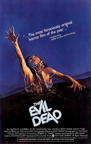 |
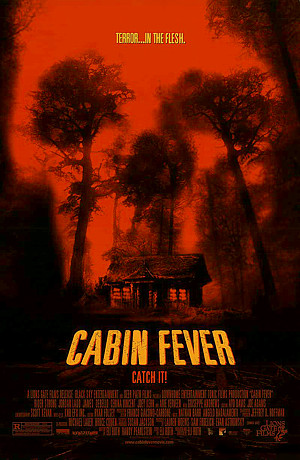 |
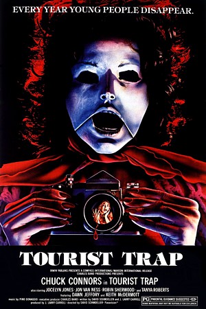 |
| THE EVIL DEAD MOVIE REVIEW |
CABIN FEVER MOVIE REVIEW |
TOURIST TRAP MOVIE REVIEW |
| FEO AMANTE'S HORROR THRILLER Created by: E.C.MULLEN JR. |
| COME FOLLOW ME @ Amazon |
| ECMJr |
| Feo Blog |
| IMDb |
| Stage32 |
| YouTube |
| Zazzle Shop |
